News
-
Mar. 5, 2026 Management & IR Notice of Convocation of the 128th Annual General Meeting of Shareholders
-
Mar. 2, 2026 Management & IR News Release Sun Chemical to invest in quinacridone production in Newport, Delaware
-
Feb. 26, 2026 Exhibition & Event News Release DIC Completes Successful Exhibition at CES 2026
-
Feb. 18, 2026 Business & Product [Vision Watch] LINABLUE® Wonder—Delivering Safe, Reliable, Consistent Natural Blue Food Colorant Phycocyanin, Extracted from Spirulina Edible Blue-Green Algae, Cultivated Using More Sustainable Smart Farming Technologies
-
Feb. 17, 2026 Business & Product Coating resins business in Indian market page has been revised.
-
Sep. 10, 2025 Business & Product News Release DIC Develops GELRAMIC™ Endothermic Pad Material that Prevents Battery Fires from Spreading
-
Aug. 1, 2025 Business & Product We have renewed the top page of our Functional Products business and product site.
-
Jan. 6, 2025 Business & Product DIC Launches Special Website for New Multicopter Drone HAGAMOSphere™
-
Mar. 5, 2026 Management & IR Notice of Convocation of the 128th Annual General Meeting of Shareholders
-
Mar. 2, 2026 Management & IR News Release Sun Chemical to invest in quinacridone production in Newport, Delaware
-
Feb. 16, 2026 Management & IR News Release DIC Enters into a Partnership with Switzerland-Based Emerald to Accelerate Business Creation in the Physical AI Domain
-
Feb. 5, 2026 Management & IR News Release DIC and the International House of Japan Launch Full-Scale Collaboration in Art and Architecture, Entering Deepening Phase
-
Jan. 6, 2026 Management & IR News Release DIC Announces Strategic Investment in AI Robotics Startup RT Corporation
-
Dec. 8, 2025 Sustainability [Vision Watch] DIC’s Global Training is Empowering People, Driving Sustainability
-
Nov. 27, 2025 Sustainability News Release The DIC Group Receives Third-Party Certification that the Methodology It Uses
to Calculate Product Carbon Footprint Conforms with International Standards -
Jul. 18, 2025 Sustainability News Release DIC Is Selected for Inclusion in the FTSE4Good Index Series, a Leading Global ESG Index, for the Seventh Consecutive Year
-
Jun. 5, 2025 Sustainability News Release DIC Coextruded Multilayer Packaging Film Obtains ISCC PLUS Certification
-
May 12, 2025 Sustainability News Release Discovering a New Spirulina-Based Environment-Friendly, Sustainable
Strategy for Suppressing Parasitic Infection
-
Feb. 28, 2024 R&D News Release DIC Develops Basic Technology for an Innovative Epoxy Resin Curing Agent
That Is Heat-Resistant up to over 200°C and Can Be Recycled -
Sep. 11, 2023 R&D News Release DIC’s Near-Infrared Fluorescent Dye Adopted for Use in MIT-Developed BrightMarker Embedded Invisible Fluorescent Tags for Object Tracking
-
Aug. 4, 2023 R&D News Release Development of Innovative Biomanufacturing Technologies Using CO₂ and H₂ as Feedstocks for Hydrogen-oxidizing Bacteria
-
Apr. 6, 2022 R&D News Release DIC Commences Partnership with Canadian Quantum Chemistry and
Quantum Computing Start-Up Good Chemistry Company -
Mar. 25, 2021 R&D News Release Sustainable Skincare from Suizenji Nori Blue-Green Algae—DIC & Green Science Materials Leverage SACRAN™ Moisture-Retention Effects
-
Feb. 26, 2026 Exhibition & Event News Release DIC Completes Successful Exhibition at CES 2026
-
Feb. 16, 2026 Exhibition & Event News Release DIC Group to Participate in PAINTINDIA 2026, One of the India’s Largest Coatings-Related Trade Shows
-
Dec. 11, 2025 Exhibition & Event News Release DIC to Exhibit for the First Time at SEMICON JAPAN 2025, One of the World’s Largest International Semiconductor Industry Trade Shows
-
Dec. 5, 2025 Exhibition & Event News Release DIC to Participate in Leading Global Technology Trade Show CES 2026
in the United States -
Nov. 25, 2025 Exhibition & Event The special CHINACOAT page has been published
-
Jan. 9, 2026 Other Discover Where DIC Stands Today — and Where It’s Heading
Introducing the “Envisioning DIC’s Future” Video Series -
Oct. 30, 2025 Other [Media Coverage] Multifunctional Robotic Finger “MoR®” Featured in Spotlight on Robotics Special Issue of International Science Journal “Nature”
-
Mar. 25, 2025 Other Caution: Beware of Spoof Emails and Text Messages Purporting to Be from DIC
-
May 30, 2024 Other DIC Revamps the Website Top Page Banner and About DIC Page
-
Jun. 8, 2022 Other DIC Launches the Asia Pacific Website
Businesses and Products
Search by Application
DIC in the Asia Pacific
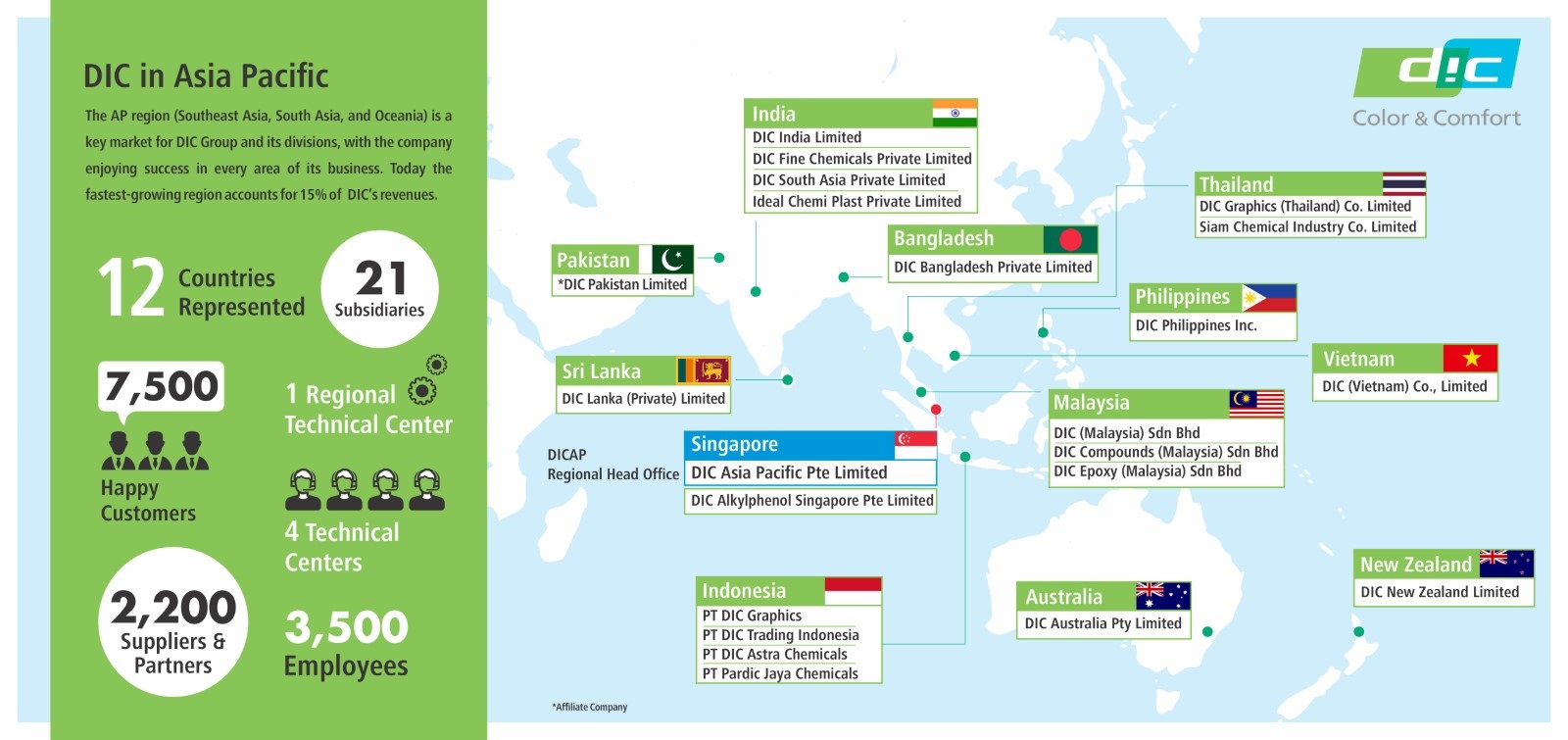
DIC has entrenched presence in Asia Pacific, with 25 plants and offices in 12 countries, providing quality products and proximity services.


