Special Feature DIC: Shaping a New Era
Color Universal Design Gains Increased Acceptance
Making society more accessible to people with diverse color vision characteristics
Even the slightest difference in grade and the smallest step can be a barrier to accessibility for people with mobility issues. Similarly, for people with color vision deficiency—the elderly or those suffering from eye conditions and diseases that affect color vision acuity—society is full of barriers related to the use of color. Color universal design (CUD)* seeks to eliminate such barriers, thereby ensuring that information is conveyed accurately to as many people as possible. This feature looks at the philosophy behind CUD and the expansion of its application.
* CUD is a user-oriented design system for products, public facilities, services and information transmission that enhances user-friendliness for as many individuals as possible by using color schemes that are easily discerned by people with diverse types of color vision.
The Rising Use of CUD in Public Facilities
Billboards and signs add color to town and cities everywhere. However, people’s perception of the hues used in graphical presentations varies considerably. Numerous factors, including genetics, aging, and eye conditions and diseases such as cataracts and glaucoma, can affect one’s ability to see colors, as a result of which there are many different types of color vision.
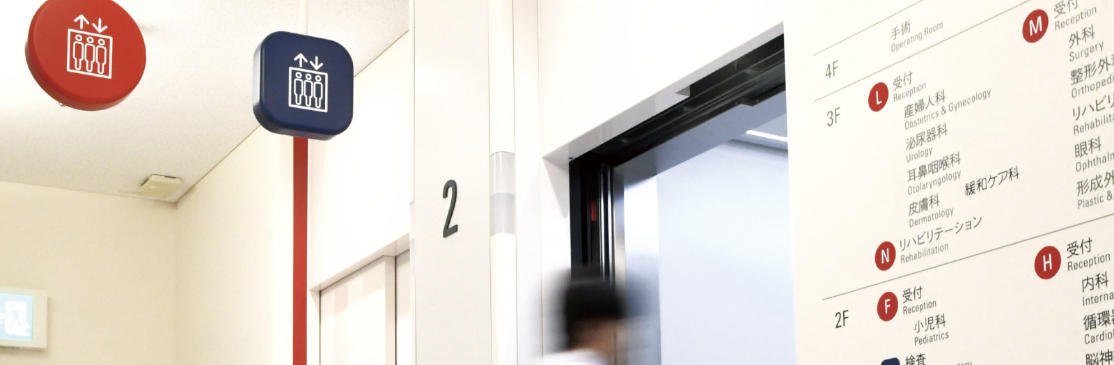
Recent years have brought an increase in facilities choosing to use signage and devices that take into account diverse types of color vision. Kosei Hospital, in Tokyo’s Suginami Ward, is one such facility. Taking advantage of its relocation to newly built premises, in 2014 the hospital used CUD to create new signage, floor maps, outpatient area number displays, automatic fee payment machines and patient call buttons, among others, with the aim of enhancing patient convenience. “The new signage might appear simple at first glance,” explains Shoichiro Hanami, a manager in the hospital’s general affairs department. “In actuality, it is really quite ingenious. We used a different combination of three elements—color, shape and text—for each department and area. So, for example, someone who’s come in for an endoscopy will be directed to the Blue Square D reception desk on the first floor.”
Through the effective use of signage in its new premises, Kosei Hospital has sought to improve accessibility and ensure accurate directions are provided to as many people as possible, not only those with color vision deficiency. The hospital also tested color schemes with individuals who have color vision deficiency in advance to ensure that those chosen could be seen easily.

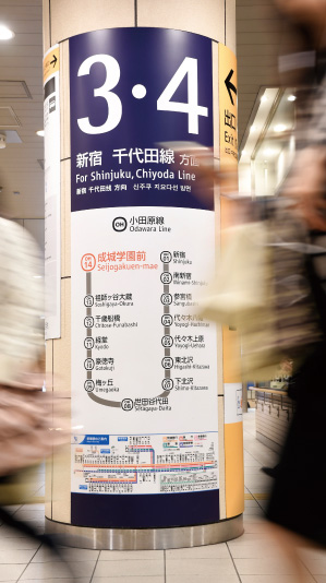
Odakyu Electric Railway Co., Ltd., switched to color combinations and designs that take into account diverse types of color vision for signs at all 70 stations on the Odakyu Line, including indicating the location of emergency alarm buttons, for which it earned the official CUD mark, awarded by CUDO. The company’s station signage development process led to its inclusion in the fiscal year 2016 Good Design Best 100—the top 100 award winners in the Good Design Awards—for fiscal year 2016. The awards are sponsored by the Japan Institute of Design Promotion.

medical testing labs and red circles
for outpatient departments.
its signage development process, the first
hospital in Japan to be so recognized.

colors that are easily distinguished by color
vision deficient individuals.
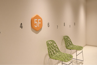
hexagon used to identify hospital wards.

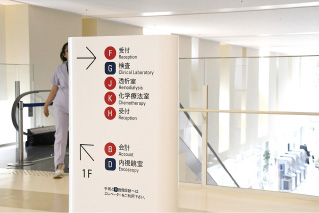
in Tokyo for elderly people requiring
specialized care, earned the CUD mark
for the color planning used to develop
its signage, which takes into account
the color vision of seniors and of people
with color vision deficiency.
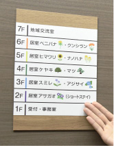
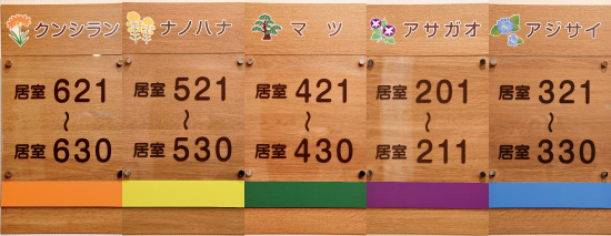

Signage throughout the facility, including floor directories in elevators and washroom signs, feature colors that are easily distinguished by color vision deficient individuals. The areas on each floor where residents’ rooms are located are indicated using a specified flower or tree name and theme color, creating a bright and cheerful atmosphere.
Smartphone Apps and Eyeglass-Format Color Check Tools
Taking the First Step Toward Understanding Diverse Types of Color Vision
The philosophy behind CUD
Awareness of barriers related to the use of color has actually been around for several decades. The term “universal design” was coined in the 1980s, replacing “barrier-free design,” a concept that emerged in the preceding decade. Developed for application in a variety of fields, including architecture and public welfare, universal design originally attracted attention as a broad range of ideas meant to facilitate the realization of buildings, products and environments that are inherently accessible by removing elements that pose barriers to people with disabilities and the elderly. As a component of universal design, in 2001 associate professor Kei Ito of Tokyo University’s Institute of Molecular and Cellular Biosciences and professor Masataka Okabe of the Jikei University School of Medicine’s Department of Anatomy, both of whom are color vision deficient, proposed that society take steps to eliminate issues related to the use of color in signage and products that pose barriers to individuals with reduced color vision acuity. In 2004, the Color Universal Design Organization (CUDO) was established with the aim of promoting the concept of CUD to companies, government and other groups on a continuous basis, a move that prompted the expanded implementation of CUD.
Thanks to active efforts by CUDO to put information out into the public domain, encouraging extensive coverage in the media, in 2005 the Japanese Ophthalmological Society officially stopped using the Japanese term for “color blind,” which has a pejorative connotation, while universities (with the exception of the National Defense Academy of Japan and the Civil Aviation College), vocational schools and high schools removed restrictions prohibiting color vision deficient individuals from sitting for entrance exams. As these changes show, recognition of color vision deficiency as a difference in ability, rather than as a disability, is gradually expanding.
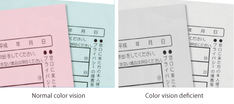
A key factor behind the spread of CUD has been advances in printing technology and computers, as a result of which the world today overflows with colorful information. Color pages in magazines and newspapers have become commonplace, while color in textbooks, electronic billboards and graphical user interfaces—which allow people to interact with electronic devices—has expanded to the point where it is difficult today to find information in any format that is not full of colors. However, the manner in which colors are used has in most cases been left to the aesthetic sense of a designer. In many cases, for color vision deficient people, who are unable to perceive certain differences in hue, this has actually made life more inconvenient.

a CUD soft proofing function that enables designers to check
on their monitor how images, such as this photograph of
advertisements on buildings in Tokyo’s famous Shibuya crossing,
may appear to people with color vision deficiency.

soft proofing.
people with normal color vision understand what the world looks like to
color vision deficient individuals.
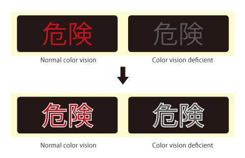
Keys to effectively conveying information without relying on color
It is important to understand that color has two functions: to express artistic sensibilities and to convey information. CUD is important in, for instance, traffic signals and road signs, in which color plays a critical role in conveying information. Colors used for traffic signals and road signs must be chosen to ensure that meaning and substance are conveyed accurately to as many people as possible. Lives may depend on it. “Easily discernable color schemes are of course important,” says CUDO deputy director Yosuke Tanaka, explaining the keys to color design that takes into account diverse types of color vision, “but color names can also be used to communicate meaning. It is crucial both to choose color schemes that can be distinguished by as many people as possible, but also to differentiate in other ways, say, by using different shapes or printing color names, thereby offering redundant clues. For example, the Tokyo Metropolitan Government headquarters tells people to ‘use green elevators for lower floors and orange elevators for higher floors,’ but in recent years they have added the color names below the signs pointing to the elevators. Obviously they realized that some visitors were finding it difficult to differentiate between the two elevator colors and as a result not reaching their desired destination, so they made a proactive change to ensure information was conveyed correctly.”
Tools that advance understanding of diverse types of color vision
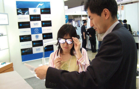
◎ Variantor eyeglass-format color check tool
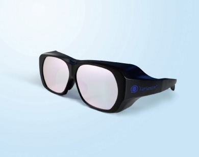
view colors confusing to people with color vision
deficiency

using Variantor
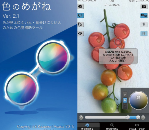
◎ Smartphone apps
Chromatic Vision Simulator and Chromatic Glass
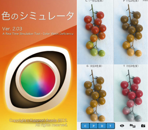
the smartphone’s camera that simulates the vision of
individuals with diverse types of color vision.
who have difficulty perceiving certain colors.
◎ Vision Deficiency Goggles
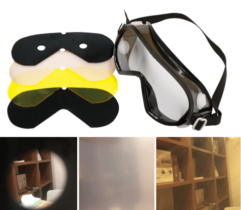
Tools for determining colors that people with color vision deficiency have difficulty perceiving
There are currently a number of tools to help determine colors that can be distinguished by people with color vision deficiency. While it is impossible to accurately understand how a color vision deficient individual actually sees colors, one can imagine the inconvenience that results from the use of color schemes in printed materials and signage comprising colors that cannot be distinguished from one another. The most commonly used include eyeglass-format color check tools; smartphone apps; and design-related software such as Illustrator and Photoshop (beginning with CS4), developed and marketed by Adobe Systems Incorporated. Among these, smartphone app Chromatic Vision Simulator is particularly easy to use and effective. A highly convenient experience tool that can be downloaded for free, Chromatic Vision Simulator enables users to identify color schemes indistinguishable to individuals with color vision deficiency simply by holding a smartphone up in front of, say, a printed document or a billboard, thereby helping them to grasp related design issues.
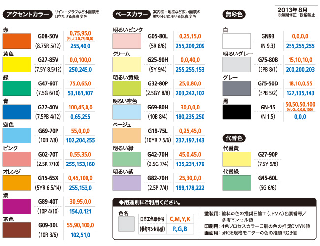
Another tool available to designers and architects, among others, to create printed materials, websites and signage that incorporate the principles of CUD is the Color Universal Design–Recommended Color Set, the outcome of R&D by multiple participating organizations, including the DIC Group. In addition to color values appropriate for printing, digital displays and coatings, the Color Universal Design–Recommended Color Set introduces color schemes that are relatively easy to distinguish regardless of color vision ability so that users can make appropriate choices.
The three principles of CUD
① Choose color schemes that can be perceived by people
with all types of color vision.
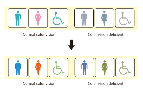
② Ensure that information is also conveyed accurately to
people who have difficulty distinguishing colors.
③ Use color names to facilitate communication.
(Example: Print color names on colors)
The First Color Guide that Facilitates Practical Color Specifications
The Color Universal Design–Recommended Color Set
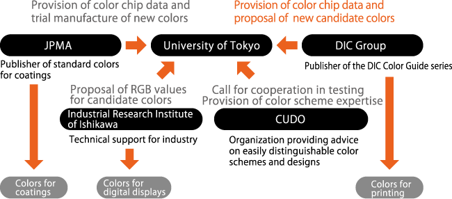
A project involving collaboration between industry and academia to realize colors that can be reproduced accurately in print, on digital displays and in coatings
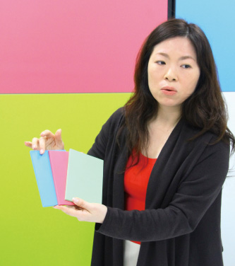
The project to develop the Color Universal Design–Recommended Color Set, participants in which included the University of Tokyo, DIC Color Design, Inc., and DIC Graphics Corporation, began in 2007. “The project was prompted by an interview with professor Kei Ito of Tokyo University in a journal published at the time,” says Tomomi Takeshita, a color planner in DIC Color Design’s Color Strategy Group. “In the interview, professor Ito spoke about his idea of creating a practical set of colors that took into account diverse types of color vision. Concurring with professor Ito’s vision from a corporate social responsibility (CSR) perspective, the DIC Group, as publisher of the DIC Color Guide® series—a color communication tool used in multiple industries—resolved to assist in the development of such a set.”
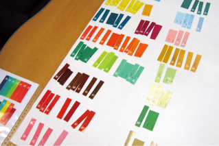
The project began with the preparation and categorization of color chips of all 2,544 colors contained in the various versions of the DIC Color Guide® series. To ensure effective communication using color to encode information, it is important that everyone uses the same color names. Accordingly, the project began with the classifying of colors into sets of 24 under basic color headings such as “red” and “blue” by people with normal color vision to represent the majority of the world’s population. Next, people affected by one of two types of dichromatic color vision deficiency (protanopia and deuteranopia) were asked to perform the same task and confirm discernibility. Colors were then once again verified by individuals with low vision or a third type of color vision deficiency (tritanopia). This made it possible to select a narrow group of candidate colors within the range of each color category that are clearly distinguishable by people with all types of color vision.
Project to develop the Color Universal Design–Recommended Color Set
Download the Guidebook for the Color Universal Design–Recommended Color Set here. (Available in Japanese only.)
The next step was to set application-specific color values. In the interest of practicality, it was necessary to set specific Munsell, CMYK and RGB values. For coatings, colors close to Japan Paint Manufacturers Association (JPMA) standard paint colors were selected. For printing, DIC Graphics created a color guide of approximate colors for process printing under Japan Color conditions. For digital displays, values were set through the adjustment and verification of colors using monitors set to sRGB mode. Versions of the color set were launched in May 2009 for coatings, October 2009 for printing and January 2011 for digital displays. In addition to being a revolutionary achievement, the setting of color values to applications for reproducing colors using three different applications served to greatly increase awareness of CUDO. “In 2013, we published the Guidebook for the Color Universal Design–Recommended Color Set,” explains Ms. Takeshita. “This is a guide outlining objectives and cautions, among others, for use of the color set.”
Process used in developing the Color Universal Design–Recommended Color Set
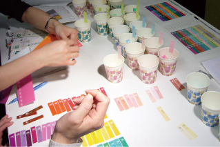
◎ Classification of colors
the DIC Color Guide® were categorized into
basic color categories by individuals with
normal color vision.
◎ Verification by people with various
types of color vision
that could be distinguished by people
with protanopia, deuteranopia and
other types of color vision deficiency.
◎ Setting of color values for different
applications
printing and digital displays and
appropriate color values were set.
Seminars at printing companies and universities help further awareness of CUD
Today, DIC Graphics and DIC Color Design are working together to plan and conduct seminars at printing companies and universities. Describing the purpose of the DIC Group’s involvement in CUD, Masashi Nishigaki, general manager of DIC Graphics’ Strategic Planning and Market Development Department, says “Color materials supplied by the DIC Group play an important role in the production of finished products, including books, other printed materials and buildings. As a manufacturer of color materials, I believe that we have a responsibility to broaden understanding of the philosophy behind CUD by designers, architects and other individuals involved in the production of such items.”
One common misunderstanding among creative people is that CUD places restrictions on the use of color and reduces the degree of freedom they have in developing designs. Thanks to a two-pronged approach that emphasizes expertise in the use of CUD and artistic expression, DIC Color Design’s seminars are important to discourage this notion. “The fact that some people with color vision deficiency have difficulty distinguishing red and green colors is fairly well known,” says Ms. Takeshita. “For this reason, many people are under the mistaken impression that CUD means an increase in the number of colors that cannot be used. In actual fact, problems can frequently be resolved with simple adjustments, such as switching to orangey-red and bluish-green, which are easier for color vision deficient individuals to distinguish. The Color Universal Design–Recommended Color Set is a carefully organized pallet of unambiguous shades for use in multicolor graphics. In our seminars, we provide perspectives on using colors in a manner suited to the order of priority for and objective of the information being provided.”
DIC Decor develops color set for decorative boards
Elementary school in Sakura, Tochigi Prefecture


DIC Decor, Inc., is the core company of the DIC Group’s building and housing materials business. One of the company’s principal products, incombustible decorative boards for use in public facilities and offices, among others, recently produced the Universal Design Decorative Board Color Set, comprising colors in three categories—red, blue and green—that have been verified as easy to distinguish by people with diverse types of color vision. Use of decorative boards in colors selected for the set enables customers to create CUD-compliant environments that are easy to use for color vision deficient individuals and seniors.
In charge of overseas procurement,
Production Control Department,
DIC Decor, Inc.
Megumi Asakura
Joined DIC in 2008. In addition to regular
duties, serves as an instructor for CUD
seminars held for general contractors and
architectural design firms.
Cross-Group initiatives that contribute to the lives of people around the world
The Tokyo 2020 Olympic and Paralympic Games are expected to bring a sharp increase in the number of foreign visitors to Japan. The last Tokyo Olympics, in 1964, attracted considerable praise for its development of a comprehensive system of pictograms that were applied across all Olympic communications platforms. As the use of pictograms helped remove language barriers from the 1964 Olympics, the 2020 Games, of which DIC is a sponsor, will seek to eliminate barriers posed by colors through the deployment of CUD, with the goal of making the event even more universally accessible. Asked about his expectations for the coming years, Mr. Nishigaki responds, “CUD enhances our ability to address to the needs of all stakeholders. It is an effort that truly embodies our ‘Color & Comfort’ brand slogan. We will continue to work with colleagues in relevant businesses in Japan and overseas to further expand our initiatives.”
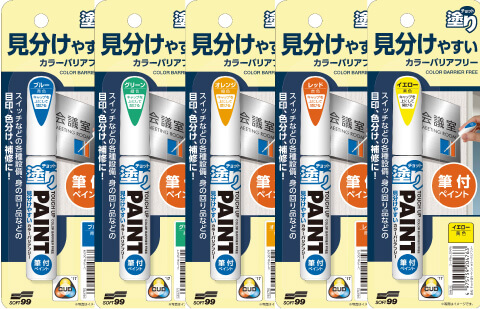
Designs that have earned
the CUD mark 
Kurashi no Mamechishiki (“Useful Day-to-Day Tips”)
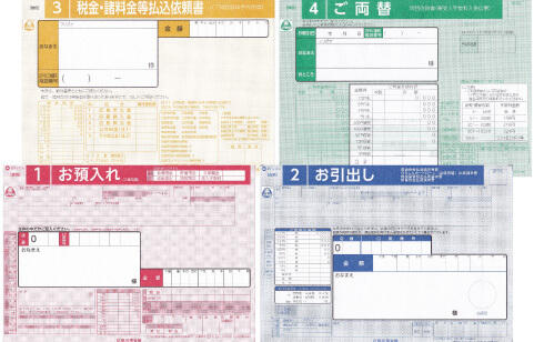
Barrier Free series
(Colored marking stickers)

BF1 series LCD touch screen
(Main body and software)
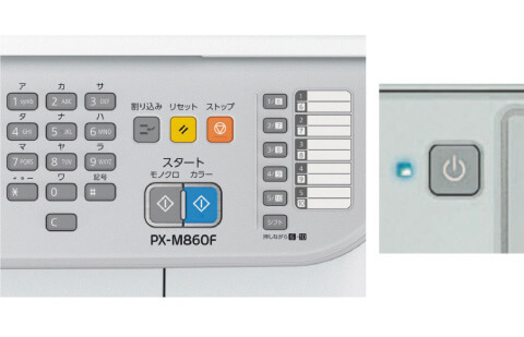
control panel and lamp colors
Ms. Takeshita adds, “In 2015, I gave a presentation at a color-related academic conference on collaborative R&D conducted by Chiba University and the Central Research Laboratories on the effect of analysis of spectral characteristics of red ink on its discernibility and the color vision of seniors. In 2017, we introduced this research at a packaging industry trade show in Germany, attracting considerable attention from participating companies. Looking ahead, we need to continue promoting Groupwide cross-business initiatives. We have also participated in the development of tactile paving to assist visually impaired pedestrians that combines high visibility and harmony with the landscape. In this, we worked with professor Ito and architect Kengo Kuma to select colors and conduct evaluations. We expect to begin marketing this new pavement to manufacturers in spring 2018.”

Color planner, Color Strategy Group,
DIC Color Design, Inc.
Tomomi Takeshita
Joined DIC in 2005. In addition to serving as
an instructor for color seminars, is broadly
active as a color planner, with responsibilities
including conducting color-related research and
analysis and making related proposals, assisting
with the planning and production of color samples,
and overseeing color management for printed
materials.

General Manager, Strategic Planning and
Market Development Department,
DIC Graphics Corporation
Masashi Nishigaki
Joined DIC in 1987. After stints in the Printing
Inks & Supplies Division and the Area Sales &
Marketing Department, was transferred to
DIC Graphics’ Strategy Department. Is currently in
charge of planning seminars and producing
the DIC Color Guide® series.
Our thanks to Odakyu Agency Inc. (http://www.odakyu-ag.co.jp), Kosei Hospital (http://www.kosei-hp.or.jp/en) and the Fresco Group (http://www.fresco-group.jp).
Photographs used with permission of: Taihei Printing Co., Ltd. (https://www.taihei.co.jp) (Variantor); Kazunori Asada (Developer) (http://asada.tukusi.ne.jp) (Chromatic Vision Simulator and Chromatic Glass); and Sanwa Manufacturing Co., Ltd. (https://www.sanwa303.co.jp) (Vision Deficiency Goggles)
Our thanks to the Color Universal Design Organization (http://www.cudo.jp).
Photographs used with permission of: National Consumer Affairs Center of Japan (http://www.kokusen.go.jp/ncac_index_e.html); The Hiroshima Shinkin Bank (http://www.hiroshin.co.jp); SOFT99 corporation (http://www.soft99.co.jp/english/); Panasonic Corporation (http://www.panasonic.biz/cn/prodisplays/); and Seiko Epson Corporation (https://www.epson.jp)