
Corporate Symbol
DIC's corporate symbol over the years
The dragon mark (1908)
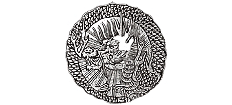
Adopted in 1908, the dragon remained DIC's corporate symbol for several decades. The dragon was selected because the birth year of founder Kijuro Kawamura (1880) was the Year of the Dragon. A highly auspicious symbol in Chinese mythology, the dragon was also chosen for DIC's product trademark, underscoring the Company's early ambition to someday expand operations into China.
DIC's former corporate symbol (1962)

With the change of its name to Dainippon Ink and Chemicals, Incorporated (DIC), the Company adopted a new corporate symbol. Created by graphic designer Yusaku Kamekura, renowned for his poster designs for the 1964 Tokyo Olympics, as well as for logo designs for numerous companies, the new corporate symbol earned considerable acclaim and was later featured in Modern Publicity, an annual U.S. publication showcasing outstanding work by designers from around the world.
DIC's current corporate symbol (2008)

The design concept behind DIC's current corporate symbol is "collaborative inspiration." The "d" stands for the DIC Group and the "c" represents "clients," that is, customers and suppliers, while the exclamation mark between them—an inverted "i"—symbolizes inspiration. This symbol thus conveys DIC's pledge to nurture inspiration through collaboration with its clients and with the companies of the DIC Group, and by building on that inspiration to enhance corporate value.
